Thursday, 31 January 2013

Images for TV (continued):

These images show the model in the third outfit that I chose, which are all a different style to the previous images. As earlier, I have selected a few images to comment on in which I think are unique and/or usable:


The setting of these next images creates a bright shine to the objects as well as bringing out the colour of the clothes. I think the pose in this image shows a sense of humor that could be a taster of the style of TV show. I think that having the model holding the shoe as a phone is a classic pose that works very well even in this image. I also wanted to have the model holding some clothes to represent the point of the TV programme that he is representing, I also think that the coat hangers play some-what of a good part in this image. Overall, I believe that this image would need some editing as I am not really fond of the colours that the effect has created but I enjoy the pose and I think many members of our target audience will be able to relate to it. 
This image suggests, with the glasses that the model is of some-what intelligence and that he is 'inspecting' what the person off shot is wearing, I think that this keeps the audience interested to see exactly what is in store for the TV show. I think that the clothes in this image could represent that fact that the presenter/model has taken these clothes from a member of the TV show as they were deemed to be 'unwearable' which again would interest an audience, leaving them asking questions about the style of the clothes that will be used in the show, what the presenter is going to be like, whether he will have the likable factor or whether he will be the 'nasty' character.
This is the final image that I have chosen to comment on from this style of images as I like the way in which it gets up and close to the host, it shows a softness in his eyes with could suggest to the audience that he is really eager and wanting to help people in looking better etc. I think that the flash affects the the image slightly in the relfection of the glasses but I hope that it is not too much of an issue. I like the light smile on the model's face as it shows a happiness for what he is doing and perhaps a love for the job. Holding the bundle of clothes could suggest that there is a lot of work that he will be doing on this show, I think that the range of colours in this image is a positive thing as it creates a vibrant style that I hope can be portrayed in whichever image I use concerning this TV show.


I chose not to comment on these images as aspects of each made the image difficult to use from the angle that the image was taken at to the items that interfere in the background.

Fourth outfit and style:


These images were also taken using the same effect as the images above. I like the effect of this image as I think it really defines the model well, he looks very clean cut and I think that the model's eyes really stand out. This is one of the first images that I have taken in landscape and I do think that in this instance it works very well. I think that this image is a good and strong image but I am not sure where exactly it would fit in regards to the images I am going to use on 21TV.
I am not really a fan of this image but I thought that it would help to comment on the negative aspects of some images as well as the positives. The background of the image is not what I wanted as the blinds and the radiator are interfering and I am uncertain as to whether such an issue can actually be editing using the software that I have available. The pose and facial expression are not necessarily far from what I am looking for but I think that I have images that I like better and that are more appropriate for the style in which I am looking for. The critical face expression does however work very well in relation to the TV show that I aiming to create and give an impression of using these images. 
I think that this image is fairly similar to the one above however it is more of a medium close up. I think this expression shows that the presenter is thinking more about the decision seen off screen. I also think that having the image look as though there is something off screen that is shocking and interesting, automatically draws the audience in. In this pose specifically, the model looks very much a part of the fashion world, he looks as if he definitely knows what he is talking about and has knowledge about style.


Fifth style: 

These are three of my favourite images that were taken during this photo shoot. 


I really like this image, I think that the 'Pin Hole' effect used really compliments the background in this image. I also think that the model looks very relaxed and genuinely happy, which is something that is important when presenting a TV programme. I think that it is also important that as well as posing in a model sense, there are also images that show a more casual side of the person, I think this image does just that. Overall, this close up image is one of my very favourites. I think that this image could be used as a sort of profile for the 21TV website.
I think the model's eyes in this image stand out a lot and this stern look could again question (as mentioned earlier) that could question the softness and kindness of the model as a presenter on the show. I really like the outfit that he is wearing in these images too and I think that the effect of this image works better with a white shirt but I much prefer the smile and brightness of the image above than the serious stare of this image.
I find that this final image is in some ways a mixture of the two images above. It has the landscape look of the first image combined with a stern look as in the second image. I do however think that this facial expression is a little softer than the one above. I also really enjoy that you are able to see a lot of the chained detail in this image. 


Above are the images that I did not comment on.

Sixth and final outfit change and different style:

These pictures taken were the last of the photo shoot, other than the outfit change there is not that much different from the images above, but these again are some of my favourite images of the shoot. I like the intensity of the eyes in this image and again, I think that the landscape image looks better than the portrait, this may just be because of the blinds on either side of the slim wall that I had to work with. Overall, I really like the facial expression and I think it shows a good, serious side of the model.
 I think this image was taken a little too early, although it is a pleasant photograph, I think that it is more of a personal image and not necessarily something that would be used on a public website. I like how the model is holding his button or in slight action, it isn't something that I got a lot of and I think in this instance, it really works. The eyes are just clearly not ready for the picture to be taken and I do not think that it is an image that the target audience would take to.
This is the final image that I am going to comment on, I like the smile of the model on this picture, it shows a kind and happy side of the model. I also like the action which is similar to the one in the image above, as it shows the model in action which I think works very well for this picture too. This particular style of image is one of my favourite of the photo shoot as the effect is my favourite of the shoot, I think it works a lot better when the images are taken at medium close up or close up rather than a long shot that includes the undesired background. 

Wednesday, 30 January 2013

Idea for 21TV website:

I have had an idea regarding the background of the 21TV website. As I am currently editing the website, I have found that it is quite plain and I think that there is definitely a need for some kind of background as I believe that some colour will brighten it up and perhaps draw the audience in even more. 

The idea that I have is at the moment just that -an idea- but I am hoping that my initial plans can be developed further and actually created. I am hoping to create a collage type background constructed of selected images that I have taken and also including the 21TV logo as I think this will have everything in it that represents 21TV. 

Tuesday, 29 January 2013

Images for TV show #1:

Here are the images with my comments (as to which I think are usable on the 21TV website and which I think are not what I am looking for).

The background of the images was not ideal but the time at which I took the images was not suitable for outside, as it was dark and the only place I had remotely suitable was my bedroom as I wanted to use a white background, I am hoping that the parts of the images that I am not happy with in regards to the background are changeable simply through some editing.

These images are not edited as I wanted to upload the selected images unedited before editing them at all: 


These two images show the main background for my photo shoot for my first and initial idea for a TV programme on 21TV about fashion. As I mentioned above, the background and location for this photo shoot was not ideal but at the time, it was the best that I could do and was available and I think that some good, decent and usable pictures were taken in this photo shoot.

As for the camera for this shoot, I used a Olympus SP-810UZ, 14 megapixel. This is my personal camera and I really enjoy taking images using different 'Magic' settings and also seeing the differences with and without flash, which is what these two images are. 

Before getting stuck in with the photo shoot, I decided to take images that would show how the background looks with and without flash. The top image shows the wall without flash, and after taking this image I thought that I would not need to use the flash, especially after taking the bottom image straight after with flash, which as you can see shows the shadows of the photographer and also objects around the room which were not suitable for the photographs I needed to capture. 

As there are many images, I have decided that the easiest way to comment on these was to look at them in groups of three:


These first three images are all very similar, as you can tell. I played with poses of the model, as well as choosing whether I use flash or not. The first image was taken without flash as I really wanted to test how the lighting and brightness effected the quality of the photos whereas the second two photos were both taken using my cameras flash, I thought that the flash would increase the quality of the photographs but in this case I found (as you can see) that the lighting did not come out white and I feel that this decreased the quality of the photos.

First picture: As mentioned above, the first image was taken without the flash and of the three images shown above, this is my favourite. I think that the lighting of this image works well as the background is as white as the wall itself. As for the props in the background, the blinds were not ideal but at the time of taking the images, this was the largest width space that was available and so I had to make do with the surroundings that I had. I think that the clock is a good prop, I did not edit the time at all but looking back I think that it would have been a creative idea to actually edit the time so that the clock represented something linking the audience with 21TV. I feel as though the clock at the time in the pictures is rather irrelevant when thought about in detail. The pose of the model in this image is fairly basic, however I think that it is relevant to the representation of a fashion programme. Overall, as this was the first image I took, I am pleased with the background and the overall look of the picture. 

Second and third picture: Again, as mentioned above these two images were taken with flash and unfortunately they did not turn out as well as I hoped. I think this could possibly be to do with the setting of the camera, other than having the flash on the camera, I had no other setting and as the photo shoot progressed and I took more images using different settings, I found that I did not have this problem as much. As I also mentioned earlier, the blinds in these images are in no way ideal but there was no other way I could take the images without including the blinds, hopefully they can easily be edited out. As for the poses of these two images, they do not differ too much from the first image but I think that have a range of images to choose from is more than helpful, even if the only difference is the facial expression. I found this to be the case (other than the lighting) in the first and third image and I am glad that there are a range of images that I can choose with the same or similar poses. I think that the shoes are again a good representation of the programme that I am aiming to create (where this specific model is concerned) and I am fairly pleased with these three opening shots.


As there are many images that are all very similar, I am not going to comment on all of them. I am going to upload the rest of the images in which the model is wearing the same outfit, possibly commenting on others before moving on to a different style:


These images are all very similar to the first three and although I am not going to go into length commenting on them, I do however like the image in the top right hand corner as I think the pose of the model and the facial expression are very complimentary for what I am aiming at. Although, the blinds do take some of the initial edge away from the softness of the picture. 

Pictures of second outfit, different style:

I have selected some images from the second outfit that I photographed. This is the first image that I have selected, as you may be able to tell, for these photographs, I changed the setting to 'Pin Hole'. I really like this setting as I think it shows the light in a nice way but also has a dimness which I think in this instance, compliments the outfit of the model. I really like this outfit as I think the different outfits that I have used are a good way of indicating the style of the TV show as well as the 'presenter' of the show.  In this image, I wanted to model to be holding clothes so that the image would in some way represent the idea of the TV programme it was taken for, which I think it does. I really like this image as I think it is very eye catching. The clock is another prop that I decided to use to represent the countdown to the start and launch of 21TV.

This is the second image that I selected as it is very different from the first one, this image shows the model/presenter favouring one outfit from another which I think is an important aspect of the TV show in which these images were taken for. The only thing that I don't like about this image is the fact that the vase is so obvious in the background. I am hoping that the aspects of the image I do not like can easily be edited out and that I can still use the image for any aspect of the website. I think the concentration on the model/presenters face also shows a certain intensity which I think goes well with the idea of the show as well as this image. 

Although I am not a huge fan of the facial expression used by the model in this image, I think that the clock plays a significant part in the countdown of the launch of 21TV and therefore I think that this image is rather important. I do think that the image could be improved a lot if the model was simply looking directly at the camera, this is my fault entirely as I was directing the photo shoot and I did not refer back to my images enough to ensure that I had the shots that I needed.  


This is the fourth and final image from this style and outfit that I have chosen to comment on. I like the pose of this image as I think it fits in very well with my initial idea of the fashion programme which can be found here.
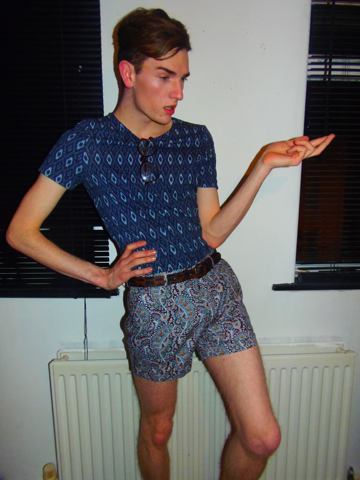
I think that having the model/presenter criticizing the clothes openly is a good shot to have, I think that this image in particular needs editing but I do think that there is potential for this image to be rather significant in my project. Although, I am unsure as to whether I think that the facial expression is a little too stern or whether it is soft enough to use. I think that if I am going to use this image at all, it will have to edited. 


The first and third images show a different effect to any of the previous images, it is called 'Soft Focus'. I do not really like this effect though as it does not define the image enough for me. I think that this style of effect would work better if the image was more defined. I also think that if the image was not a main focus of what I need it for, this effect may also work. For example- It may work well with the background that I mentioned about creating in the earlier post. I may try out creating the background with one of these images included. 

The middle image is the same 'Pin Hole' effect as the images above, which I think works very well. Although, you can see the flash in this image I am hoping it is editable if I wanted to use this particular image. I think that the stance of the model is effective in the image as it feels strong. I also like the way that the model is holding the clothes and the clock so strongly. This image again suggests that the countdown to this model's fashion programme has begun, which is exciting! 

First photo shoot:

I was able to take some images this evening to bring to life the first idea that I had about a show on 21TV which can be found here. I was able to take some pictures of a friend and I specifically chose him for his interest in fashion, I thought that it would be a good idea to ask someone that already has knowledge and perhaps some ideas as to what would be a good show for the market. Although, he is male and not necessarily a member of our target audience, I decided that having an input from someone that was genuinely interested in fashion would be wise as it could help develop my initial ideas further. 

I took 80 image this evening, a small number of these were blurry and therefore I thought that uploading them would be unnecessary however I am unsure as to whether uploading and editing 80 images for one aspect of this website is a little too much. I have not yet decided which of the images I would like to use on the website, before I go any further with the website, I am going to look through the images again and carefully select the images that I would like to have on my blog, analyse them and then cut that selection down once again to the number of images I would like to use for this particular idea on the website of 21TV. As there are so many images, I am going to upload them on the next post.

A name for the fashion TV show will also follow the images, I would prefer to see which idea in relation to the show's name, matches the style and the character of the images and male model I have taken images of. 

Channel Launch Information Box:


The image above shows where the information box will be placed on the 21TV homepage, I am pleased with the placing of this design, I do think that this design needs a little adjusting as far as the colouring is concerned or some form of video to follow it up, making the concept more interesting. I think that creating a video about the launch of 21TV will catch the attention of the audience more than a simple image.

Although as Eleanor and I are not particularly skilled in editing videos and creating them to a standard at which we would be pleased, this make take more time than planned. 

Saturday, 26 January 2013

Editing- Channel Launch Information Box:

I have decided that a less confusing and more efficient way to track the editing of the website is to have separate posts for each page that Eleanor and I are working on. The first page that I am going to continue and really get stuck in, working on is the home page:

As mentioned in the earlier post, I have shown two print screens from the home page already which can be found here. I am going to continue now where that post ended and as stated throughout the previous posts when editing the website, I am going to construct as much text as possible as Eleanor and I have not yet been able to gather as many people as needed for our photo shoots yet, this is something that we are working very hard on and hope that our friends and acquaintances are able to help us in the upcoming weeks.

This print screen shows a box that is positioned half way down the home page. This box will have images placed in it as well as constructed text. However, at current I have placed some plain text from the Wix headings entailing what will be in the box when it is completed. I have decided to add all of the basic text before adding the constructed text from Photofiltre and the images. As you can see from the fox placed on the right hand side, I would like it to contain information on the channel launch including images of the cast members. I plan on constructing the text separately from the images, therefore the text can be constructed any time and placed ready for the images.

I am going to look through some text techniques and edits and apply them to a design of my own that will include all of the information above:

FIRST EDIT:

This is the first edit that I have created, although there is not all of the information that I am going to need in the box, I decided to keep the first edit simple: 

As you can see I first added the logo as I thought that something containing information of the channel launch, should definitely include the logo. The 'COMING SOON' text was constructed on Photofiltre, simply by creating a 'Duo tone' of colours and copying the transparent text onto it. Although I sometimes find editing on Photofiltre very time consuming, I do think that the program creates the best result for what Eleanor and I are aiming to create. I am not very fond of the text used in this example as it is very difficult to see the colours of the text and the audience are also going to struggle to see the duo tone and as such an edit was time consuming to in the end, capture the attention of the audience, I do not think that this text serves the purpose of where it is going to be placed. I do however like the style of the constructed image and I also think that the light blue colours work well with the black, however I am unsure as to whether a female audience will relate to this as much as they would if the colours were warmer and more feminine including pinks and purples.

SECOND EDIT:

This is the second edit that I have created, I used the same amount of information as last time as this is just a tester to analyse the text, colours and appeal to our target audience. The only thing that I have changed from the first example of an edit is the text of 'COMING SOON' and then colours and style that I have used.

I really like this second example, especially a lot more than the first example. I think that the colours are a lot more relatable to the target audience that Eleanor and I are aiming for as there is a strong use of light colours including pinks, yellows and white. I think that these array of colours really compliment the black of the 21TV logo. I created this text by using an image of flowers as the background. The background of the text can easily be replaced with your own choice of background using Photofiltre, I think that this style is very bold and strong as there are not many backgrounds of text that use flowers. However, I do not think that you can see the flowers well enough to know what they are. Nevertheless, I think that this is very appealing and I would not hesitate to use it for the 21TV website.

THIRD EDIT:

This is the third edit that I have created to be placed in the box of the homepage. I think that  this third design is very similar to the second design apart from the colours of the text filler. Nevertheless, I like the colours that have been used in this design. I think that they also work well with the black of the logo. However, I think that this design would have worked better if I had chosen a more diverse font type. Although, if I were to choose this specific style, I could easily change the font type and make the colours more mixed. I originally created the fill for this text by again using duo colours, but in a different way. In the first edit, I used the duo colours from top to bottom but in this third edit, I have used the colours from left to right. I think that this works better than the first design but this could also be due to the differences in the text used in the first and third edits.

Of all of the designs that I have created so far, the second design is my favourite as the colours and even the simple idea of using flowers to attract a female audience. I am going to develop the second idea more now before asking members of my target audience if they are intrigued by the design.

EDITED DESIGN TWO:

This is my new design of the second edit, as this was my favourite design of the three, I decided to develop it a little more.

 As shown in the image to the right, I added some more text, still using the image of flowers as the filler. The good feature of using flowers as the filling of the text is that you can using more than once as there are so many colours on one image! In the text, I added a date, I did not specifically picked this date, I originally wanted a date that was a fair few weeks away, giving Eleanor and I time to complete our project. I also changed the text from 'COMING SOON' to 'COMING TO YOU' because I felt that the later went more with a date, whereas the original 'COMING SOON' is just something that fits in alone. 

Update: 29/01/2013- Originally, this design was suppose to be placed in the box that is shown above. However, after creating this design, I realized that it is in fact too large both width and length ways to fit into the box that I had chosen. I am now looking at other possibilities as to where to place this image about the launch of 21TV. The option that stands out most is at the top of the home page, where a slide show will be once the images are uploaded to the website, the design of the launch could be a feature of the slide show, however this is something that I will have to discuss with Eleanor before finalizing. 

As this design is now completed, I am going to look at completing other aspects of the home page. 

Friday, 25 January 2013

Construction and editing of website:

As I mentioned in my earlier post, I have now begun editing our website and until Eleanor and I have taken images that we are satisfied, I am going to start by adding the text needed and creating text boxes where Eleanor and I would like the images to be placed.


The first print screen is of the home page, it shows how to edit the title of the pages and it also gives you the option to add a link as a drop down menu, which although it was one of the features I enjoyed of the websites I researched, I don't think that Eleanor and I are going to use the feature on our website. I am currently happy with the layout of the menu bar that we have created but if my opinion of that changes before publishing the website, it can easily be changed which I think is a very good feature to have. 

The second print screen shows the home page as it currently is, (this is the print screen also in the post below, I thought that it would be good to add it in to the editing process.) The large box seen in this print screen will be a slideshow of images when Eleanor and I are able to take the images that we would like. I am leaving the box currently blank as I am already aware of what will be in the box when the completion of the website nears, as for other sections of the pages, including further down the home page, I have added text to a box in which images or a video may be placed so not only I do not forget exactly where things are going to be placed but also so that it is clear on my as to what will be placed where.

 As I have now shown how to edit the pages, and deleted the unwanted template text, I am now going to begin adding the desired text:

As the third print screen shows, I have chosen to begin editing the 'Shows' link as I think that without the images, this will be the easiest page to begin editing. I am going to continue adding and editing the text so that the page is ready for the images and is then completed. 

Thursday, 24 January 2013

Ideas for programmes on 21TV:

In relation to the types of programmes on our television channel, I have been thinking of original ideas in which we could use to develop as programmes. I am going to try and develop the first idea I had, which was to create a programme that is fashion based, as programmes such as America's and Britain's Next Top Model are relatable to many members of our audience.

I think that as fashion based programme is a good show to have on our TV channel as it will not only attract our target audience, but also perhaps people from outside of our desired age range, appealing to older women. I think that for this projec it will be somewhat essential to look into the existing programmes of the same genre, allowing us to find an appropriate place in the market for the type of show that we want to create.

I am briefly going to look at America's Next Top Model and Britain's Next Top Model:

America's Next Top Model is a reality television series in which women compete for a modelling contract and to be crowned America's Next Top Model. The show was created by Tyra Banks, who is the host, head judge and executive producer. There are usually 10-14 contestants, one is eliminated each episode after taking part in a photo shoot each week, there are also challenges for the contestants to compete in throughout the series. Makeovers are given to the contestants fairly early in the series and towards the end of the 'cycle' there is an international destination scheduled in which the final five or six contestants travel to a destination to continue the final leg of the competition. Britain's Next Top Model is a British version of the same show. 

I have also taken some inspiration for this from Plain Jane, a show in which I will write about in the near future.

21TV idea: 
America's and Britain's Next Top Model are enjoyable TV programmes to watch although I do not think that there is space on the market for another modelling show. I think that Eleanor and I are looking to create more of a fashion based show, where the clothes and style rather than the model is at the focus. My original idea for our fashion based TV show is to have a male host, that the female audience can take an interest in. 

As for the content of the show, Eleanor and I have agreed that a show, advising people on how to dress better on an every day occasion and helping them with fashion based skills for everyday life is a good idea and we think that there is a space for this in the market. We are very much up for criticism from our target audience as to what they think of this idea as we are for all of the ideas that we have about the production of what is shown on our TV channel and its website. We do not currently have a title for this idea as it is very much in the process of creation and influence from the shows currently on the market as well as our target audience, this includes the name of the TV show.

12/02/2013 UPDATE: Since writing this post, I have taken images for the idea mentioned above and I have been thinking on names for the programme for my finalised idea, which is: A host advising people on how to dress better in every day life and helping them with fashion based skills. There will be a different contestant each week, that will get help from the host. As for names, I have chosen Fashionsta after looking online for a basic definition, I came across the meaning "a devoted follower of fashion" that I thought fit very well for the idea of the TV show. I am now going to select an image and add the desired text to it, which will then be the finished step of the first page for the website.

Tuesday, 22 January 2013

Production of website:

For the production of our website, Eleanor and I have decided to use Wix, a free website, enabling you to create a website. Before choosing Wix, we looked at other websites that also allow us to create a website but we decided that Wix was the best option for us. Another good feature of Wix is that it allows you to complete your website to your standard before publishing it on the internet.

The first step to creating our website is either choosing a template or theme, which can be changed at any time or simply starting from scratch with a blank canvas, either way we are able to inject our own colours, style and ideas onto our website. Eleanor and I had originally decided to start our website using a blank canvas, however after further discussion between the two of us we have now decided to use a template and the adapt it to the style that we would like for our TV channel and its website. We have found a template that we both agree has good features that can be amended to fit with the style of  our TV channel.

First introductory print screen

This is the first print screen of the beginning editing of our template. So far, I have deleted all of the content that was originally on the template, including pictures, text and links and I have replaced them with the text that Eleanor and I have chosen, such as the menu bar along the top of the page. As I continue with the progress of editing, I am going to do as much as possible without the images until we have found as many people needed to complete the different styles of images needed to complete our website. Eleanor is currently looking into people that could be used for the images as I am continuing with this progress, I will be posting every step of the way. This print screen is just an idea as to what we will be creating: 


As for other features of the website, we have agreed on the URL 21tv as it is simply the name of our television channel and will not cause confusion for our audience when trying to reach our channels website. Once we have a basic idea of our websites layout, style and colours that we would like to use, Eleanor and I will begin creating the television programmes that we would like our our channel. These tasks can then run alonside each other as we add our desired programmes to our website.

(22/01/2013 - Although this post has been in my drafts for some weeks due to January revision, I have attempted multiple times to upload images of the template of our website, but for some reason blogger currently is not uploading images from the 'Upload' button. I have the print screens saved and I will upload them at college or at a later date when the functions are working properly. I will continue to work on editing the template of our website until I am able to upload pictures. Eleanor and I are currently getting in contact with friends and trying to find peopler willing to have images taken of them for our TV channel, once we have our desired number of people, it will make the website a much easier task but as it is not simple trying to find 10+ people to be a part of our TV channel and website, this is an ongoing process and we are hoping that it will be on the way to completion, with the images sometime during February.)


Tuesday, 8 January 2013

Update: Christmas break.

I have not posted over the Christmas break as I have been revising for my January exams, even though is may not be a wise decision in terms of my Media work but I had to prioritise and I made the decision to focus on exam revision. Even though., I have ultimately taken almost a month out of doing my Media coursework, I felt that revision was necessary over the Christmas break.  As it is now time to return to college, I am motivated and ready to get back to coursework along side my revision.