Friday, 14 December 2012

Ideas for Logo:

Eleanor and I have started generating some ideas of the logo that we would like to create. We continued the ammend and improve our original idea. We are currently using a verity of programs to create our desired logo.

Eleanor and I both adjusted the logo that we designed, we made a few logos as we were unsure which one would fit our TV channel, here are our initial ideas for our 21TV logo:

This is our initial hand drawn idea, it has been edited on Photofiltre.
 
 I like this design as I think it is compact and eye catching, I also like the way that this particular design is edited as I think the curves and edges give it a rough, young look.
 
As there is no colour on this particular design, if we decide that this is the design we would like to use, we are not sure if we would add colour or if we would simply leave it black and white. I like the logo in black and white as the simplicity of it compliments the business of the design itself.

Although, I am unsure as to whether this will be clear to see for our audience, not knowing that our channels name is 21TV, they may be confused as to what the logo says. To find of for definite, Eleanor and I are going to ask members of our target audience if they understand our logo. As much as Eleanor and I like this orginial design of the 21TV logo, we may have to look at other options as the image of 21TV.
 
Eleanor has uploaded some of our other logo ideas which can be found here. We are going to continue working on our logo designs and developing them as much as possible, keeping in mind the ideas of our target audience and what they would like to see 21TV look it.

19/12/2012 - Eleanor and I have asked our target audiences about the logo that we have created and we recieved mixed results as the majority of people said that they understood our logo and liked the design, saying it was 'modern' and 'catchy', whereas others were confused by what we had created and did not understand what the logo was saying. Despite these mixed views, we have decided to keep our original design, editing it to add some colour, making it a little more relatable to our female audience,  before we begin creating our website.

Thursday, 13 December 2012

Production of Website:

Eleanor and I are now starting to look into production ideas for our website as we have collected all of the information that we need to begin the design of our website, we are happy with the changes made to the target audience and we are pleased with the mixture of results that we have recieved from the questionnaires.

We started the process of producing our website by thinking of a name for the TV channel, we decided to do this first as it would be a good platform to begin with and enable us to create the other aspects of our website from there. When thinking of names, we had to keep in mind our target audience of females and ensure that we came up with something relatable to them, still considering the range of ages in which we are also going to accomodate for, (18-24 year olds.) Keeping all of that in mind, Elenaor and I came up with the name 21TV as we liked the sound of the short yet catchy name. We also liked the fact that even though we are solely accomodating for females, this name does not shut out a male audience if they are interested in a show on '21TV' they will not be turned off by the name of the channel. We chose this name as 21 is the middle of the age range in which we are aiming to attract and it is also the infamous age associated with young adults which we thought we a key aspect for the name of our channel.

Now that we have a name that we are pleased with, the next step is creating the logo for our TV channel. Eleanor and I had already generated a few ideas, one in which we really liked, the design is hand drawn so we have deicded that if we do not create anything better on our desired program, we are going to scan the hand drawn image and ammend it. As for colours, we have decided that even though we are creating this for a female audience, we are not going to make pink the central colour of the website as we believe the female audience is already a broad and vast audience to crack, we are going to use a verity of colours that appeal to every type of female.

Wednesday, 12 December 2012

Questionnaire Results:

After handing out our questionnaires to 15 females and 15 males within our target audience of 18-24 year olds, Eleanor has now collected these results and they have been presented in pie charts using Microsoft Excel:


Howver, after discussing our findings and looking over the information that we receive, we have decided to change our target audeince from both males and females to females only, keeping the same age range as we still think it is appropriate.
 
 The reason for changing the gender of our target audience is simply because accomodating for both genders means trying to please an extremely vast auidence all at once and we believe that this is an unrealistic target as our verity of programmes are unlikely to please such a wide range of people. We think that concentrating on targetting females would increase the quality of work that we produce and even though our audience will be considerably smaller than the one we first anticipated, we know more about accomodating to the wants of females in terms of the type of programmes in which females enjoy watching.
 
We also thought that females share a wide range of interests as far as watching TV in concerned and we think that trying to please every aspect of one gender would be more benneficial in comparison to trying to please fringes of both gengers and not achieving a long-lasting audience.

Wednesday, 5 December 2012

Plans for TV channel:

After conducting our research, Eleanor and I have decided to discuss our plans for the television channel, the audience we are going to be targeting and the shows in which we will be creating.  

Target audience: We have decided that our target audience will be people similar to our ages.  We would ideally like to aim our television channel at 18-24 year old people as we think we will be able to encapsulate the interests and likes of young adults more than any other age group. Deciding the age of our target audience is the first step, as we are both girls we will most likely aim our television channel at mainly girls although we do want to attract a male audience as much as we can. As our research influenced our choices in target audience, the combination of MTV, BBC3, Channel 4 and Sky Living will also have an effect on the construction of our channel, mainly the shows that we create. 

Programs/Shows: As mentioned above, our research will influence our choice and design of programmess. We have not yet decided on our plan of shows nor the number in which we will need to create for our television channel. Although, programs such as Geordie Shore (MTV), Criminal Minds (Sky Living), Britain's Next Top Model (Sky Living), Teen Mom (MTV) and Some Girls (BBC 3). These shows are all roughly aimed at the same target audience in which we will be appealing to. We would also like to provide our target audience with more verity of shows. 

To get some feedback on our initial ideas, we have decided that we think it would be a good idea to create a questionnaire, asking people of our target audience, which types of television programmess they would most want on a new television channel. We think that this will give us a clear idea of the things in which our target audience are looking for in order to attract them. 

Questionnaire: Here is a link to the questionnaire that Eleanor and I created.  We handed out our questionnaire to 15 students at our college that are within our target audience. We will also be handing it out to family and friends within our target. Once we have collected our results, we are going to present our findings clearly using charts on Microsoft Exel. 

Current television programmess: We have decided to draw up a list of existing television programmes in which we would roughly like to base our own TV channel on:
  • Reality: Geordie Shore (MTV), Britain's Next Top Model (Sky Living), The Only Way Is Essex (ITV 2), Big Brother (Channel 5).
  • Drama: 90210 (E4), The Vampire Diaries (ITV 2), Gossip Girl (ITV 2), The Secret Circle (Sky Living).
  • Game Show: Take Me Out (ITV), The X Factor (ITV), Chris Moyles Quiz Night (Channel 4).
  • Documentaries: How Britain Worked (Channel 4), Big Fat Gypsy Weddings (Channel 4), One Born Every Minute (Channel 4), Ladyboys (Sky Living). 
  • Comedy: An Idiot Abroad (Sky 1), 8 Out of 10 Cats (Channel 4), Celebrity Juice (ITV 2), Come Fly With Me (BBC3).
  • Chat Show: Friday Night With Jonathan Ross (ITV), Alan Carr: Chatty Man (Channel 4), The Jeremy Kyle Show (ITV), Piers Morgan's Life Stories (ITV). 
These programmes vaguely indicate the type of TV program we would like to have on our channel, although we have not yet recieved our questionnaire results and will have more of an idea on the prgrammes we would like to include when we have these results.

Thursday, 22 November 2012

Research: Menu bars.

I have decided to look into menu bars separately as I think they are an incredibly important feature of any website. They allow the audience to navigate their way around the site, making the website simple and easy to access. I think that having a good, easy-to-understand menu bar is essential for the website that Eleanor and I create as if the audience cannot easily navigate their way around our website, they may lose interest very easily. I am going to look at various menu bars, their positions and how they work as I think these are the most essential points of a menu for websites. I will also compare them as I look at one from another.

I am firstly going to look at the MTV menu bar as I have looked at other aspects of their website:

The menu bar is located along the top of the website. The colour of the menu bar stands out in contrast with the rest of the website, this makes the menu bold to the audience. The text of the menu is bold and easy to read which I think is an important aspect as some unclear menu text can make navigating websites difficult and stressful.

Hovering over the links, will show a list of everything relating to the chosen link. As shown in the image on the left, the 'shows' link provides a list of not every, but the most popular shows on MTV, making looking at one desired part of the website accessable with just one click. This can sometimes be important for the audience as they may not want to get confused trying to find what they are looking for on the website. I think that the MTV menu does exactly what a menu should, enables the audience to access any aspect of the website they wish with minimal clicks and wondering around the site, without getting bored this is sometimes an issue as if the someone cannot find what they are looking for without hassle, they will simple give up. 

I found it very easy to navigate the MTV website through the use of their menu bar, I think that the layout is precise and easy to understand, which is very helpful when having such a busy website like MTV's.

The second menu bar I am going to look at is that of Sky Living, again as I have looked at other aspects of their website:

The Sky Living website has two menus as shown, on the left. The menu at the top of the page are links to the important aspects of the Sky services, including 'Find & Watch TV' allowing access to watch programmes aired by Sky. This link in particularly makes watching TV online easy. The main menu of the Sky Living website is very spacious as there does not seem to be as much information to contain in comparison to websites such as MTV. The colour of black used for the menu bar, contrasts well with the pink used throughout the rest of the website. The text of the menu is easy to read although, I did not think that it was very eyecatching due to the dark colours together of black and grey. 


The features of the menu itself are similar to those used on the MTV website, the menu bar is a drop down menu, listing the links related to each  heading on the menu. Similar to the MTV menu bar, the Sky Living menu is also a drop down bar, although the features of this menu are slightly different, the are multiple options for each aspect of the menu.  For example, the 'SHOWS' link I found rather confusing and it took me a few minutes to navigate my way around the website. As a member of the audience for sky livings website, I did not find that this was helpful and quite frustrating and I would not like a member of my target audience to feel this confusion or frustration when trying to navigate their way around my website. The much simpler style of MTV was far more efficient and easier to navigate. 

Wednesday, 21 November 2012

Research: Sky Living:

After initially choosing to research MTV and Channel 4, as we thought that these particular TV channels were aimed at a similar audience to our target- young adults. We then thought about other TV channels and websites that we could research, coming up with BBC3 and Sky Living and even though both of these channels stem from large companies, they are channels that we both watch and since we are around the age of our target audience, we decided that these channels would be suitable to research. 


 The Sky Living logo is not much different from the regular Sky logo, it is very plain although the Sky Living logo uses hot pink to stand out, I think this makes the particular logo stands out but predominantly to women as pink is usually associated with females. The text used for this logo, as in general for Sky is quite plain, this is not always a bad thing though as simple text is always easy to read and does not take time to recognize a company.
 
 
I am now going to look at the website for Sky Living, I will use print screens to analyse my research:

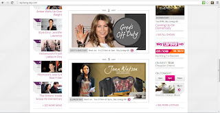
When clicking on the Sky Living website, I thought that the home page was very neat and well organised but I also found it very plain and simple. The simple design works well with the neatness of the page but there is not much colour. There are blends of pink and purple throughout the home page which I think works well with the integration of black and grey throughout the page.  

When looking properly at the layout of the website, for the first time, it seemed as though the page was aimed at adults due to the simpleness.  As with MTV, Sky Living have an image bar below the menu bar at the top of the page. I like this feature on this website, as on MTV. I think that it works particularly well on this page as there are not many large and colourful images other that the ones intermittently changing on this bar.    

I think that as on the MTV website, this would catch the audiences attention. Specifically so on Sky Living as there is not much other colour due to the simple house style.   

When scrolling down the page, I found that the text used for headlines was not very eye catching as it was grey rather than a bold black. I think that black would have worked better as it would have helped define the sections of the website, rather having to concentrate and not be captured by the bold text.  I found when I proceeded down the page that there were a lot more images than I would have thought, I think that this is a good feature although, I found on the second look at the page, there is not enough text. There is actually minimal text on the page and although the images are eye-catching, I think that any target audience from teens to adults would want more text than what is shown on this page as the picture initially engages the audience but then there is no text to grip them into clicking on the image.       


The only text shown on this page is towards the very bottom of the page where the heading 'The Buzz' can be found, this feature allows the website to be linked with other social networking sites which I think is a key feature of every website. Social networking has become a huge part of every TV program and channel that seem to be connected to at least one social networking site. 

I am now going to look at a link from the Sky Living website: 

I am going to analyse the 'Shows' link as Eleanor and I will be creating shows for the channel, I think that this is an appropriate link to look at. I first clicked on the shows link and and an A-Z list was shown, although I do not think this is necessarily an important page to look at, I thought that it would be a good idea to look at every aspect of the 'Shows' link.  

The A-Z list of shows was a fairly simple page, showing all of the shows on Sky Living, I think that this is a good feature as audiences can view all of the shows aired on Sky Living. If the show is currently running on Sky Living, there is information as to when the show will next air. I think this is the most important feature of this page. I also think it is good that shows that are not 
currently airing, are still listed on this page. 

Similar to the A-Z list of shows, the 'What's On' link shows a list of the Sky Living schedule for today, listing which shows are on and when with a small description of each, I think that this is a good feature as it allows the audience to see as much as they would on a Sky TV guide, if not more online. The schedule list is a scrolling list, I think that this is good as it does not take up the majority of the page, although is it big enough to be the most important feature of the page. 

On the right hand side of the page, there are links to small articles of particular shows. I clicked on the article about Elementary which took me to a page with images and captions of the show. I think that it is good to have a verity of things to look at concerning many different shows. The bottom of the page also allows the audience to interact with others sharing the same interest and 'have their say'. On the right hand side of this page, there is also a news column, I think that this is a good feature even though there is 'Latest' page in the top menu bar. 


Eleanor's Research:

Here is a link to Eleanor's Channel 4 research and BBC3 research.