Thursday, 22 November 2012

Research: Menu bars.

I have decided to look into menu bars separately as I think they are an incredibly important feature of any website. They allow the audience to navigate their way around the site, making the website simple and easy to access. I think that having a good, easy-to-understand menu bar is essential for the website that Eleanor and I create as if the audience cannot easily navigate their way around our website, they may lose interest very easily. I am going to look at various menu bars, their positions and how they work as I think these are the most essential points of a menu for websites. I will also compare them as I look at one from another.

I am firstly going to look at the MTV menu bar as I have looked at other aspects of their website:

The menu bar is located along the top of the website. The colour of the menu bar stands out in contrast with the rest of the website, this makes the menu bold to the audience. The text of the menu is bold and easy to read which I think is an important aspect as some unclear menu text can make navigating websites difficult and stressful.

Hovering over the links, will show a list of everything relating to the chosen link. As shown in the image on the left, the 'shows' link provides a list of not every, but the most popular shows on MTV, making looking at one desired part of the website accessable with just one click. This can sometimes be important for the audience as they may not want to get confused trying to find what they are looking for on the website. I think that the MTV menu does exactly what a menu should, enables the audience to access any aspect of the website they wish with minimal clicks and wondering around the site, without getting bored this is sometimes an issue as if the someone cannot find what they are looking for without hassle, they will simple give up. 

I found it very easy to navigate the MTV website through the use of their menu bar, I think that the layout is precise and easy to understand, which is very helpful when having such a busy website like MTV's.

The second menu bar I am going to look at is that of Sky Living, again as I have looked at other aspects of their website:

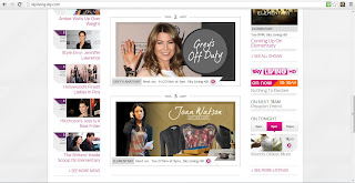
The Sky Living website has two menus as shown, on the left. The menu at the top of the page are links to the important aspects of the Sky services, including 'Find & Watch TV' allowing access to watch programmes aired by Sky. This link in particularly makes watching TV online easy. The main menu of the Sky Living website is very spacious as there does not seem to be as much information to contain in comparison to websites such as MTV. The colour of black used for the menu bar, contrasts well with the pink used throughout the rest of the website. The text of the menu is easy to read although, I did not think that it was very eyecatching due to the dark colours together of black and grey. 


The features of the menu itself are similar to those used on the MTV website, the menu bar is a drop down menu, listing the links related to each  heading on the menu. Similar to the MTV menu bar, the Sky Living menu is also a drop down bar, although the features of this menu are slightly different, the are multiple options for each aspect of the menu.  For example, the 'SHOWS' link I found rather confusing and it took me a few minutes to navigate my way around the website. As a member of the audience for sky livings website, I did not find that this was helpful and quite frustrating and I would not like a member of my target audience to feel this confusion or frustration when trying to navigate their way around my website. The much simpler style of MTV was far more efficient and easier to navigate. 

Wednesday, 21 November 2012

Research: Sky Living:

After initially choosing to research MTV and Channel 4, as we thought that these particular TV channels were aimed at a similar audience to our target- young adults. We then thought about other TV channels and websites that we could research, coming up with BBC3 and Sky Living and even though both of these channels stem from large companies, they are channels that we both watch and since we are around the age of our target audience, we decided that these channels would be suitable to research. 


 The Sky Living logo is not much different from the regular Sky logo, it is very plain although the Sky Living logo uses hot pink to stand out, I think this makes the particular logo stands out but predominantly to women as pink is usually associated with females. The text used for this logo, as in general for Sky is quite plain, this is not always a bad thing though as simple text is always easy to read and does not take time to recognize a company.
 
 
I am now going to look at the website for Sky Living, I will use print screens to analyse my research:

When clicking on the Sky Living website, I thought that the home page was very neat and well organised but I also found it very plain and simple. The simple design works well with the neatness of the page but there is not much colour. There are blends of pink and purple throughout the home page which I think works well with the integration of black and grey throughout the page.  

When looking properly at the layout of the website, for the first time, it seemed as though the page was aimed at adults due to the simpleness.  As with MTV, Sky Living have an image bar below the menu bar at the top of the page. I like this feature on this website, as on MTV. I think that it works particularly well on this page as there are not many large and colourful images other that the ones intermittently changing on this bar.    

I think that as on the MTV website, this would catch the audiences attention. Specifically so on Sky Living as there is not much other colour due to the simple house style.   

When scrolling down the page, I found that the text used for headlines was not very eye catching as it was grey rather than a bold black. I think that black would have worked better as it would have helped define the sections of the website, rather having to concentrate and not be captured by the bold text.  I found when I proceeded down the page that there were a lot more images than I would have thought, I think that this is a good feature although, I found on the second look at the page, there is not enough text. There is actually minimal text on the page and although the images are eye-catching, I think that any target audience from teens to adults would want more text than what is shown on this page as the picture initially engages the audience but then there is no text to grip them into clicking on the image.       


The only text shown on this page is towards the very bottom of the page where the heading 'The Buzz' can be found, this feature allows the website to be linked with other social networking sites which I think is a key feature of every website. Social networking has become a huge part of every TV program and channel that seem to be connected to at least one social networking site. 

I am now going to look at a link from the Sky Living website: 

I am going to analyse the 'Shows' link as Eleanor and I will be creating shows for the channel, I think that this is an appropriate link to look at. I first clicked on the shows link and and an A-Z list was shown, although I do not think this is necessarily an important page to look at, I thought that it would be a good idea to look at every aspect of the 'Shows' link.  

The A-Z list of shows was a fairly simple page, showing all of the shows on Sky Living, I think that this is a good feature as audiences can view all of the shows aired on Sky Living. If the show is currently running on Sky Living, there is information as to when the show will next air. I think this is the most important feature of this page. I also think it is good that shows that are not 
currently airing, are still listed on this page. 

Similar to the A-Z list of shows, the 'What's On' link shows a list of the Sky Living schedule for today, listing which shows are on and when with a small description of each, I think that this is a good feature as it allows the audience to see as much as they would on a Sky TV guide, if not more online. The schedule list is a scrolling list, I think that this is good as it does not take up the majority of the page, although is it big enough to be the most important feature of the page. 

On the right hand side of the page, there are links to small articles of particular shows. I clicked on the article about Elementary which took me to a page with images and captions of the show. I think that it is good to have a verity of things to look at concerning many different shows. The bottom of the page also allows the audience to interact with others sharing the same interest and 'have their say'. On the right hand side of this page, there is also a news column, I think that this is a good feature even though there is 'Latest' page in the top menu bar. 


Eleanor's Research:

Here is a link to Eleanor's Channel 4 research and BBC3 research. 

Thursday, 15 November 2012

Research: MTV


I have decided that instead of researching individual aspects of the project, I am going to research specific TV channels, including their website, newspaper advertisements and double page spread articles made, providing that each of these are available for the TV channels that I have chosen to research. I also think it is important to look at names of television channels and also their logo as it will be used a lot throughout my production. Although, I think it may be difficult to find a double page spread for TV channel's, therefore I will take a look in listing magazines for this piece of research. 

The first TV channel that I have chosen to look at is MTV as it is a channel that would be most like the channel in which I am aiming to create. Although, I think that MTV's target audience is quite small as all of the TV shows aired on MTV are specifically for a young adult audience. 


I think that the logo for MTV is plain and simple, which is good if there is a lot of exciting colour used throughout the TV channel and website, which for MTV, there is. I like the bold text of this logo and I also think it is good to have the name of the TV channel in full sometimes, which MTV show in this particular logo. I think that the logo of something such as a TV channel is vital in some ways as it becomes a way for people to identify the channel and it is easier if the logo is a simple design including the channel's name. 


I am now going to look at the website for MTV, I will use print screens to analyse my research:

This is the home page for the MTV website, I like this website as the colour used really stands out and catches your attention. There are also lots of colours used in the images shown on this page of the website. I especially think that the large image bar on the first image, currently showing Taylor Swift is a very good feature as on the website the image changes intermittently to show the latest news, with images, this feature drew me in purely by it's use of images.

The bar at the top of page, showing a drop down menu of every aspect of the MTV website, including music and shows. The channel and website that Eleanor and I will be creating will feature a menu similar to this as having a menu is a vital  aspect of a website such as MTV. 

As you scroll down the home page, you have options to click on countless links, which will take to you many individual pages, I think that the coloured links, as shown saying 'NEWS' 'MUSIC' and 'SHOWS' is also a good feature as the colours are eye catching, even with all of the other bright bursts of colours used throughout the rest of the page. I think that these links are good as they take you to perhaps the three most important features of MTV, I think that they are also very well placed.  After the coloured links there is an option to view 'more' of any aspect that you like, I think that a feature like this, showing what is available to read and interact with is an excellent feature and definitely something that would benefit any website. Although, MTV is a website that also features news quite heavily, I am unsure as to whether a news feature on the channel I am hoping to create is a good idea but I think that it works very well on the MTV website and also the channel. 

MTV could perhaps use so much colour as their target audience is young adults, they will want to keep their audience interested using bright images and lots of bright colours.

I am now going to look at a hyper-linked pages from the MTV website as our brief is to include hyper-linked webpages. The first page that I chose to look at was the music page as music is a main aspect of MTV:

I like how this aspect of the MTV website has the same home style as the rest of the website, as most websites do. But I feel as though this is too much of the exact same information as what is presented on the home page. It is difficult to find many differences between what is shown here and on the homepage.      
 
When creating our website, Eleanor and I would like to create more diverse links but keeping the same home style but showing more creativity.  Although, it may just be the music link that shows such similar information and as I look more into the content of the website. I like that there are options to watch a vast verity of videos on this website and I think that the colour scheme throughout is well organised and definitely something that I think would look nice on the website that Eleanor and I are going to create.  I also like the option to scroll down the chart list, I think that this is a good feature to have. 

When clicking any link of your choice, within the page you are on, it takes you to a completely different layout, using similar texts and colours though, so keeping within the house style it enables you to watch a vast verity of videos from many of your favourite artists.  I think that the amount of video available to watch on this website is wonderful and certainly a very positive feature to include.        

Another brilliant feature continued onto this page of the website is the use of vibrant colours, shown through images, the background of the page and the headlines. The image bar at the top of the page changes intermittently which also keeps the audience's attention, which is a key aspect of a successful website. 

MTV website: http://www.mtv.co.uk/

Initial Plans:

Eleanor and I have begun our research into TV channels of our choice. We have decided to research MTV (as shown below), Channel 4, Sky Living and BBC3. To divide the workload, Eleanor and I will be researching two channels each, we will then share the research on each others blogs as a group. 

When we have completed our research Eleanor and I are going to discuss our findings including  which aspects of each website/TV channel we like and would possibly be interested in using in our own website. 

We have created a plan on the whiteboard in our Media lesson and will upload images of this when possible. The plan has given us a brief outline of everything that we will need to consider for this project. Although, we have not gone into extreme detail at current, we are hoping to do this in our next lesson. 

New Brief:

I have chosen to do Brief 9: A website for a new TV channel together with a newspaper advertisement for the channel and a double page spread for a listings magazine, focused on the channel's launch as I wanted to challenge myself from the print based coursework in which I created last year. 

I am going to ask Eleanor if she would like to work with me on this brief, if not,  I shall be creating the project alone.  

I am going to do all of the research together, I will then go on the create the newspaper advertisement and the double page spread and finally the website. I think that it will be more beneficial to get the extra components completed first.  

UPDATE: 15/11/2012 Eleanor and I are going to work together on Brief 9 and are going to create a website and the extra options together.

Wednesday, 14 November 2012

Important Information!!!

Eleanor, Marie and I are no longer working as a group. 

Therefore, I am going to choose a different brief to create. I am unsure at the moment as to which brief I would like to create alone as I am choosing between two briefs:

Brief 8: The first two pages of an original local newspaper together with (if chosen,) a billboard poster for the newspaper and two hyperlinked pages from the paper's website. 

OR

Brief 9: A website for a new TV channel together with (if chosen) a newspaper advertisement for the channel and a double page spread for a listings magazine, focused on the channel's launch. 

I am aware that I am running out of time to choose a new brief and will be making the decision very soon. 

Monday, 12 November 2012

Production of Text.

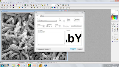
To create my newspaper advertisement, I am going to use Photofiltre, which is the program I used to create my AS coursework, I found that it was an easy program for what I was creating:


Using the tools that Photofiltre provides, I will now create the text for the newspaper advertisement. 


My first step is to upload the image of the Cholera bacteria, which is shown in the image above. Uploading the image was very simple, clicking the open folder allows you to access your images and select one to upload. 


I am now picking which text I would like to use. Selecting the text that I am going to use may take longer than usual as usually deciding on the colour of the text would be extremely important, as I am not deciding on a colour I have to ensure the text is wide enough to show enough of the image to be able to identify what is filling the text. Therefore, I may have to try out a verity of fonts to find the best fit. 

Although, when creating my advertisement I will have to use the information for the whole documentary series and not just focus on Cholera, although that is the clip that we will be focusing on, I will have to focus on the specific episode and series rather than the individual clip. 


Text:

The font above is Arial Black. This is the first font that I have tried out with the Cholera bacteria as the filler. I like this font as it is quite thick and I think that this is needed for the font that I am going to be creating. However, I do not think that you can see enough of what is filling the text to be able to identify it. This may cause confusion for the audience. Although the font does not show enough of the bacteria, I think that the different shades work very well. 


The font above is Cambria. I like this font as it is longer but also more dense. I like the style of text when it is positioned close together and I think that this is style I would like to use on the advertisement. Although, with this text I do not think that there is enough of a difference in the colour, as shown in the first text that I used. As I am using different fonts to find the one that I think will suit the advertisement best. 


Thursday, 8 November 2012

Initial Ideas for the Advertisement.


My initial ideas on the newspaper advertisement I am creating:

From the research that I have carried out, the images I have taken and the advertisements that I have seen, I have a basic idea of how I would like the advertisement to look:

Image/Background:

As Eleanor is the presenter of the documentary, I think that it will appeal to our target audience and also a wider audience in which we are trying to engage. I would like Eleanor to be standing in the graveyard for the picture used on the advertisement as it will show the setting on the documentary and hopefully give the audience an insight into our documentary and what the expect. As I said in the previous post, I am unsure of where I would like Eleanor to stand for the images that I am going to take but when we go to take the images, I would like to take a verity of images around the graveyard and create a few mock-up advertisements of different images, showing them to select members of our target audience, allowing them to give feedback on the advertisement they prefer. I will then most likely use this advertisement as it is the audience's choice. 

I am unable to travel to the graveyard and take the images at present but I am going to use another picture of Eleanor as substitute for the image I will then replace it with. However, this means that I will not be able to fully analyse and criticize the advertisement until I have taken the images. Although, this can be done as soon as the images are taken and one is chosen for the advertisement.  


Text/Title: 

When researching Cholera, on the Wikipedia page the image used is the bacteria of Cholera, this is an image that I will not be able to recreate myself, unfortunately. Although, my initial idea for the text of the text would be to use it as the filling for the text, instead of a colour. 

After running my initial ideas by the group, I will proceed to create the advertisement before presenting it to members of our target audience for their feedback. 

Images and Ideas.


After researching some advertisements and documentary posters, I now have an idea of how I would like the advertisement to look and also ideas on the font and style of the text I would like to use.

I plan on using an image of Eleanor in the setting of our documentary for the background of the advert as Eleanor is the 'face' of the documentary, she will appeal to more of an audience than  perhaps just a plain setting of the graveyard in which we are going to film our documentary. 


Eleanor and I went to the graveyard on October 25th 2012 and took some images of the setting to get an idea of where the documentary will be filmed and also what would be a good background for the advertisement image:

There are still more images that are needed to be added. Although the images that I have here do not necessarily represent a background for my advertisement, they do show some of the graveyard that will be used for the documentary and also include different angles, some of which work well and others do not. 

The first image on the left is a close-up of the Cholera cross, I thought that it would be important to get a close image of this to show the writing carved onto it. Although it is not all that easy to read or see, the close-up image will hopefully show that there is something to read on the cross. 

The image in the middle is Nelly Brennan's grave which is surrounded by bars (as you can see in the bottom left of the image) and would not be legible on the documentary as it is on the ground. Therefore, I thought that taking a picture of it was a good idea as it could then be used in the documentary as a still image. 

The third image, on the right, is another image of the cross in the first image and as you can see, the writing on the cross is not legible at all. I like this image as it shows not only the cross but the background of the graveyard, this shows that the Cholera grave is actually an extremely vast grave. This can also be shown in the video. Another point about this image is that is shows how small the Cholera cross is in comparison to the rest of the graves in the graveyard. 


Wednesday, 7 November 2012

Research: Newspaper Advertisements.

As I am going to be working on the newspaper advertisement, I have decided that I would like to make the advertisement look modern. Cholera is a disease that hit the island in 1832 and learning this may not interest a broad audience. As the target audience for this project is varied, I am putting a modern twist on my advertisement in hopes that it will interest a younger audience in watching our documentary. 

I have started looking at adverts to analyse, allowing me to get a better idea of the advert that I will be creating for our project. I began my research looking on the internet for images of 'documentary posters' and although my findings stem away from the type of documentary that my group will be making, I decided to look further into the posters of some of the documentaries and short films in my findings:


This documentary poster appealed to me for its simplicity even though the documentary is it advertising is not the genre of documentary that my group will be creating. 

At first glance, when researching documentary posters online, this poster instantly caught my eye because of it's vast landscape of the city buildings in the front view and also the background, the man in the middle of the poster who is in mid air, shown to be thousands of feet from the ground and finally the simple font used for both the title of the documentary and the review of it being 'exhilarating'. 

The general simplicity of this advertisement appeals to me as I find that the simplicity of it is what makes it so eye-catching and interesting. I think the simple colour of black works very well with the poster and emphasizes not only the text but also the rest of the image as the sky is shown in the background.   


To find some accurate research of newspaper advertisements of documentaries I will look through British newspapers and analyse the advertisements found in them. When researching advertisements of documentaries in newspapers, I was not able to find any suitable adverts. The adverts I came across were more for use on television although stills of the advert could be printed in a newspaper. 


Although this advertisement is not for a documentary, it is one advert I found in a newspaper that was similar to the type of advert that I will be designing. I chose to look further at this advert because at first glance I found it eye catching due to the colours used. The text in the center of the page is the most eye-catching of all as it uses bright and vibrant to colours to catch the attention of readers looking through the newspaper. The man in the picture is also relevant to the type of advert that I am going to make as Eleanor will be representing our documentary as the presenter and images of her will also be used throughout the pieces that we create. 

This advert is also quite different from the advert that I am looking to create as it has a lot more text than I am intending to have on my advertisement. The text in bold is also a style option that I may look into after seeing this advertisement as it emphasizes the important information on the piece, this will also be necessary for my advert.