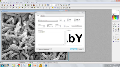
To create my newspaper advertisement, I am going to use Photofiltre, which is the program I used to create my AS coursework, I found that it was an easy program for what I was creating:
Using the tools that Photofiltre provides, I will now create the text for the newspaper advertisement.
My first step is to upload the image of the Cholera bacteria, which is shown in the image above. Uploading the image was very simple, clicking the open folder allows you to access your images and select one to upload.
I am now picking which text I would like to use. Selecting the text that I am going to use may take longer than usual as usually deciding on the colour of the text would be extremely important, as I am not deciding on a colour I have to ensure the text is wide enough to show enough of the image to be able to identify what is filling the text. Therefore, I may have to try out a verity of fonts to find the best fit.
Although, when creating my advertisement I will have to use the information for the whole documentary series and not just focus on Cholera, although that is the clip that we will be focusing on, I will have to focus on the specific episode and series rather than the individual clip.
Text:
The font above is Arial Black. This is the first font that I have tried out with the Cholera bacteria as the filler. I like this font as it is quite thick and I think that this is needed for the font that I am going to be creating. However, I do not think that you can see enough of what is filling the text to be able to identify it. This may cause confusion for the audience. Although the font does not show enough of the bacteria, I think that the different shades work very well.
The font above is Cambria. I like this font as it is longer but also more dense. I like the style of text when it is positioned close together and I think that this is style I would like to use on the advertisement. Although, with this text I do not think that there is enough of a difference in the colour, as shown in the first text that I used. As I am using different fonts to find the one that I think will suit the advertisement best.


No comments:
Post a Comment